Data Design - Building a Basic Background
Dashboard design is one of the things I’m most passionate about in my practice, and definitely one of the things I get asked about the most often. I think a well-designed dashboard really helps to bridge the gap between the storyteller and the audience. But for many people, venturing into this territory can be daunting. From choosing a design platform to applying best design practices, there are a lot of decisions to be made. And I want to help you. To do that I will be launching my ‘Data Design’ series. I’m going to show you my tips and tricks, interview people who have absolutely honed their craft, and give a peek behind the curtain at the bumps of the process.
About This Project
So, where to start.
Well before I even get into the elements and theories of design, I believe it’s important to have a tool that’s going to best support you in your journey and that you feel comfortable exploring. And because of that, the first installment of the series will be a demo on how to build a basic dashboard in three of the most popular design tools: PowerPoint, Figma, and Adobe Illustrator. I asked three people who I believe to be very highly skilled at these individual platforms to provide a run-through on building the same dashboard across the tools.
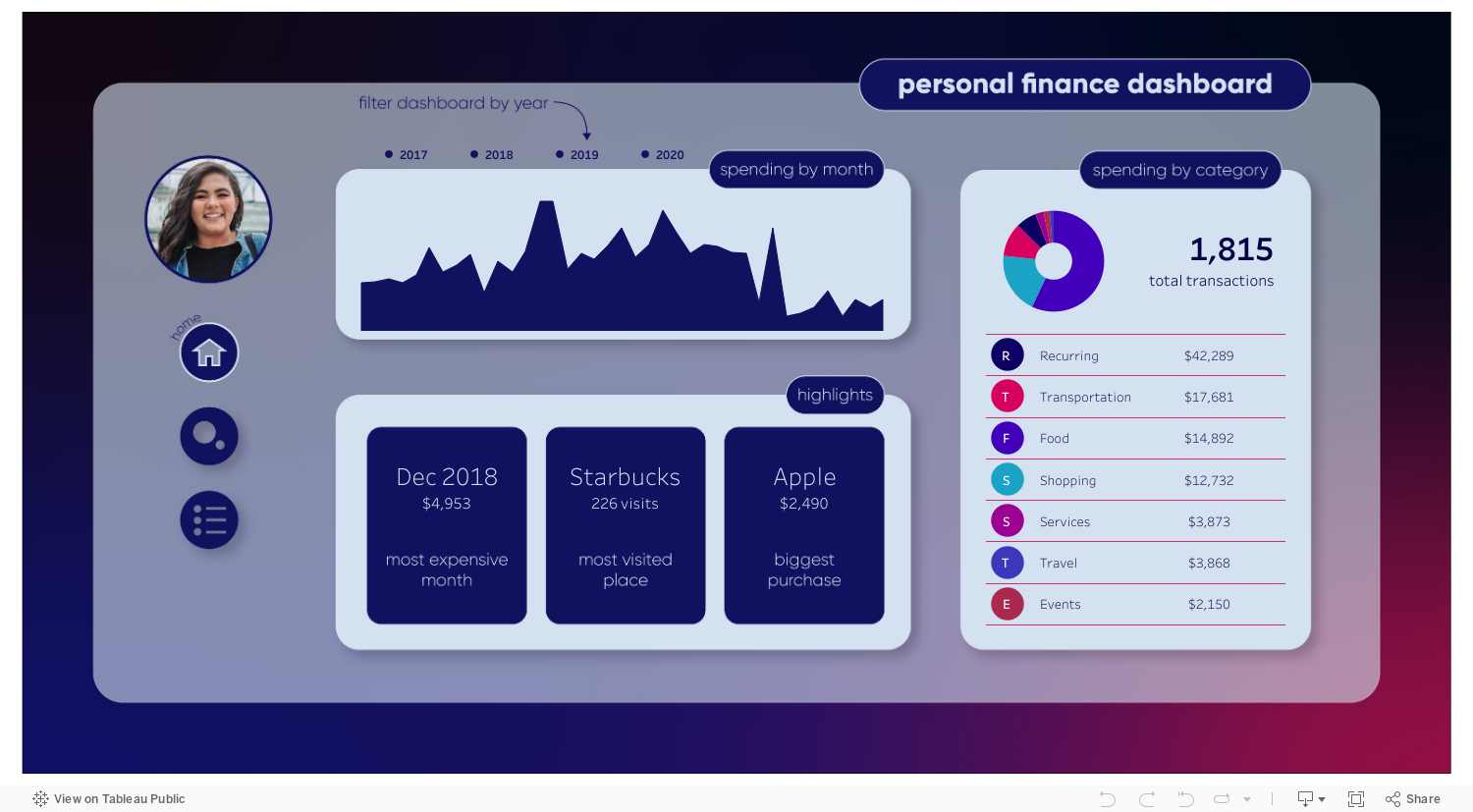
The base for this dashboard is a viz I created about my personal finances. This dashboard includes popular items in data visualization such as pills, rounded corners, gradients, and drop shadows. This will be less of a tutorial and more of an introduction to show how easily these pieces come together, some of the customization options, and what the process of building a dashboard looks like. Though there are many tutorials available online that showcase how to accomplish the individual pieces that we’ll be covering, my goal with this is to provide a foundation that will make new designers feel ready to start using one of these tools.
Q&A with the Designers
Biggest thanks to Lindsay Betzendahl, Kevin Flerlage, and Sam Parsons for helping make this idea come to life and being so patient with me along the way. In addition to having them demo the dashboard building, I’ll be asking them some questions about the tools that they use to help you more easily decide what’s going to work for you.
Lindsay will be demo-ing Figma, Kevin will be demo-ing PowerPoint, Sam will be demo-ing Adobe Illustrator. Their answers are in regards to those respective platforms
How long have you been using the tool and in what ways do you use it most?
Lindsay (Figma): Shockingly, I’ve been using Figma for about a year now, although it wasn’t until 6 months ago that I really took some time to learn all it had to offer. Initially, I used it for a few simple background images and buttons that I needed to create for some work projects as well as personal vizzes. Those mostly consisted of some simple rectangles and drop shadows. More recently, I’ve taken some time to really understand the tool - learning how to do things faster (duplication shortcuts), using the align tool, understanding vectors, curves and frames, and exploring prototyping (Figma’s interactive feature for design). So now I use it for a few different purposes. While I used to mainly create individual shapes (as I had done in PowerPoint for years), I now mostly create full background images as well as fully functional prototypes for work clients that mimic a Tableau dashboard without having to build it in Tableau or even have data to use. I use Figma pretty much daily at work for Tableau rebuilds (designing a dashboard from Tableau fully into Figma), background images, and custom buttons. I believe that Figma is a huge step up from PowerPoint and yet doesn’t have the learning curve that something like Illustrator has. It’s easy to learn and use. I just recommend learning some of the tips and tricks first so that you can be quick and effective in your builds.
Kevin (PPT): Well, I’ve probably been using PowerPoint for 25 years…maybe longer. Historically I used it for its intended purpose, for presentations. However, when I first started learning Tableau about 3 years ago, Ken introduced PowerPoint as a great tool to “draw with”. I still use PowerPoint for presentations, but I use it more often for Tableau dashboards, both business and personal. The most common use is for titles using custom fonts and for buttons.
Sam (AI): I have been using Adobe Illustrator for just over a year. To begin with, I was muddling my way around without any real knowledge on how to use the tool, or what was actually available in it. It was only about 10 months ago when I took a week-long course to become Certified in Adobe Illustrator did I actually start understanding how to use it correctly. Was the best decision I made!
I use Adobe Illustrator in my day job heavily, making my own icons for dashboards, infographics to tell a story and even designing data posters for print. Outside of work, I use Illustrator to add some design flourish to my personal projects, and within those it is mostly to play around with typography - which I have come to love! I also used Adobe Illustrator to design Eva Murray’s latest book cover for her book: Empowered by Data.
Do you have experience with other tools, and if so, what sets this one apart?
L (Figma): I have experience with all three of the tools (PowerPoint, Figma, and Illustrator) that are in this discussion. Most of us have used PowerPoint for years, but perhaps not in a design way. I started using PowerPoint to create custom buttons many years ago as well as titles and shapes (such as lines or circles) to bring into Tableau. However, it was a bit clunky and limited. I always knew I was working in a tool not really meant for this sort of design. It’s meant for presentations. Figma, on the other hand, has all of the same functions as PowerPoint, but has added design tools. Plus, it natively allows you to organize your work into projects and folders. This way, I can go to one place and find all my work. I can copy/paste from one project into a new one. I found this much better than opening a single PowerPoint slide deck or having multiple ones to house a few random shapes I had created. Plus, you have the option to create “components” and add various objects to a library to use later. This allows you to create custom icons to use again and again or even custom color palettes to access for objects. Additionally, unlike PowerPoint, Figma has a HUGE canvas to work in. This means I can actually build a large dashboard image and zoom into the single pixel level to create detailed work. I can’t do that in PowerPoint very easily. I use Illustrator as well, but I find the tool complicated and less intuitive. Finding everything I need is difficult and while, yes, it has way more options than Figma, it’s also much harder to learn on the fly. So while I have created images in Illustrator, I use it more for editing vectors that I purchase so that I can use them as custom images, but I rarely build a full image from scratch in Illustrator because it’s just faster for me to do it in Figma.
K (PPT): I use a tool called http://Paint.net for some of my work, mainly building in transparency and color fills. I also utilize Adobe Illustrator quite frequently at work and I’ve been using it more in my personal projects. I think the challenge with Adobe Illustrator is that it’s intense. It is not very intuitive and has a long learning curve. It’s also expensive. PowerPoint, on the other hand, is a tool 99.9% of people have access to, have used, and are familiar with. There is much less of a learning curve.
S (AI): Before Adobe Illustrator I was using Powerpoint for all my design stuff, both within work and outside. It was the ask of creating Posters that led me to Illustrator, as I knew I needed a proper design tool to help me get the desired finish. Powerpoint is surprisingly useful at creating icons and supplementary design elements (such as annotations and design backgrounds), but Adobe Illustrator just has so many more features and is designed for building vector graphics. Illustrator is just so rich in options and as a result, is so flexible to use.
If you could change something about the tool what would it be?
L (Figma): I wish that there was a desktop application of the tool that would save locally so that it could be used offline. Currently, it’s fully web-based. I also find some of the gradient color options to be a little harsh - meaning the transitions, or color stops, don’t appear as smooth as another tool like Illustrator. Also, and probably my biggest frustration with Figma, is their font library. Yes, they have like a bazillion fonts to choose from but you can’t see what the heck they look like! I often have to select my text and click through every font until I find one I like. It’s not a very good experience, so I’ve found 2-3 I like and I stick with those. Figma does have plugins that you can use, and there is one to solve this problem, to enhance your experience, but I think having the font name displayed in the actual font isn’t too much to ask. Additionally, you cannot bring in other fonts. Since it’s all web-based, you get what you get. Again, there are a ton to choose from, so that is a plus in the long run, just hard to find one you may like quickly.
K (PPT): A couple of weeks ago, I would have asked for PowerPoint to implement layers, but then Autumn Batani showed me that they did, in fact, have layers. So I’d probably ask for the ability to trim to overlapping objects. Autumn, can PowerPoint do that too?
Autumn here: yes PowerPoint can do that. Check out an upcoming blog from Kevin on PowerPoint tips to find out how.
S (AI): Pricing would be the obvious one, at £20 a month, it is not cheap. I have it for free on my work laptop, but I also pay for it on my own personal laptop - I love it that much and couldn’t be without it! It’s good to keep personal and work projects separate and it is safer to do so.
As for features, I would change within the tool? I would like a quick key to come out of the type tool. This is rather specific, but when typing a piece of text you normally want to scroll out and pan around to the next part of the design, but your cursor remains within the text box, and to zoom out you would normally hold down the ‘z’ key for the zoom tool - yet what happens is you end up putting lots of Z’s into your text box, which you don’t want. Currently to come away from a text box that you are typing in you have to hold ‘Ctrl / Cmd’ and click onto the canvas. I find it infuriating! Haha.
Is there anything you think people should know about the tool when they start?
L (Figma): Take some time to learn the basics. Perhaps watch a few of the free YouTube videos Figma has put out. Even in the past 2 months I have learned a ton of new techniques and ways to create objects faster and with more precision. I would have saved myself a lot of time if I learned these things upfront. For example, you can hold down alt/option while selecting an object and drag to duplicate it. However, let’s say you want to create a few shapes and need them evenly spaced. You can press cmd/⌘+D to duplicate the layer then drag the layer to where you want it. Then press cmd/⌘+D again and again and it will duplicate the layer and place it exactly the same number of pixels away from the previous one in the same direction (up, down, diagonal). I think it’s also worth knowing that the tool is FREE but that it is web-based. This means that nothing is saved to your computer and you need the internet to use it. This also means it’s not secure and do not create anything (or copy/paste anything) that has PHI/PII in it. There is a desktop app version, which I use just to get it out of the browser, but it’s still web-based. Lastly, there are various options for exporting images at a higher resolution. Upon export, you can select a PNG at 2x or 4x the size. Additionally, you can export to SVG, which is a great option for using an image in Tableau as it renders faster and at a higher quality than a PNG. Just note that if your Figma design has imported images in it, those cannot be exported in an SVG file. All this is to say that for a free tool, I believe that Figma is better than PowerPoint but cheaper than Illustrator and easier to use, so Figma is the clear way to go!
K (PPT): Well, I had that question a lot so I created a couple of videos to help people get started:
S (AI): Adobe Illustrator has a lot of hidden options, that if you are not familiar with Adobe Creative Apps (such as Photoshop or InDesign), then you will not know these features are there. I am referring to the additional options created when using any tool if you hold down any of ‘Ctrl / Cmdl’, ‘Shift’ or ‘Alt’ keys - or any combination of these. They convert the tool you are using to a different function that you would not have found otherwise. For example: Using the Pen Tool, when holding down the ‘Alt’ key and selecting an ‘anchor point’ it will change the intersection from a curved intersection to a sharp straight line intersection and visa-versa.
Another initial learning point with Illustrator is that you can bring in as many ‘panels’ as you like into your tool pane and customize your view as you would like to use it and keep all the tools and options front and center as you see fit.
Content
Bookmark this blog as I’ll be updating it with links to the videos as they come out. The release dates for the videos will be as follows:
➔ Lindsay Betzendahl (Figma) - Thursday, February 25, 2021
➔ Kevin Flerlage (PowerPoint) - Sunday, February 28, 2021
➔ Sam Parsons (Illustrator) - Thursday, March 4 2021
I hope this helps people who are ready to get started adding more design elements to their data work. If there’s anything else you would like me to cover in a video/blog in future installments of this series, fill out this form! I have a lot of fun things in mind but I also want to cover topics that are going to be most helpful to you. Catch you in the next one.