My Alignment Chart of Charts
I have a confession to make: I love charts.
Just kidding, you probably already knew that. And it has only been a recent realization that maybe the reason I love charts is that I love organization. I love lists. I love compartmentalizing things. And I love diagrams.
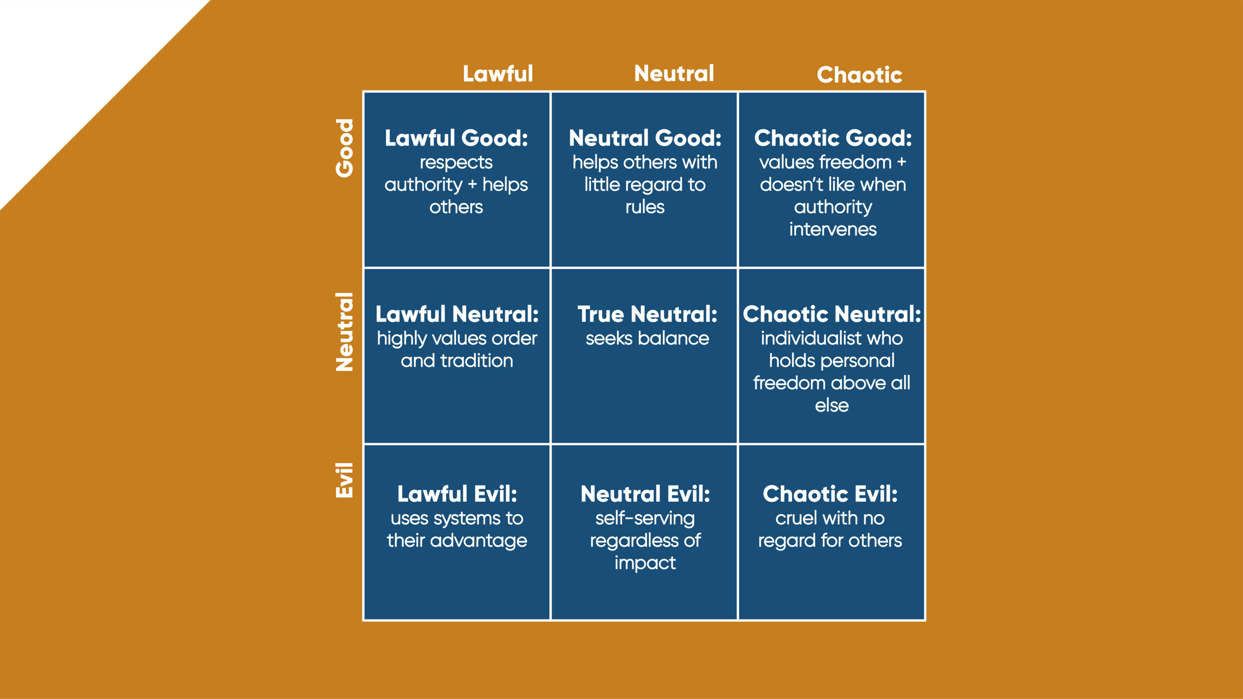
This is my simplified interpretation to help introduce it to those who are new to the system. Some additional resources are linked in the next paragraph.
One of my favorite organization diagrams (yes, one of many) is the Alignment Chart. The alignment chart is a 3x3 grid that looks at whether something adheres to the rules/respects authority and benefits others. Only while researching for this blog did I find out that this comes from Dungeons and Dragons. But this has been applied to everything from Marvel characters to french fries (either of which you may see in a future blog). And while thinking about the alignment chart this week, as one does, I had the most epic idea: I’m going to make an alignment chart of charts. That’s right. I will be categorizing charts we’ve come to know and love in our regular practice with this system. Here goes nothing.
For this specific application, when I think of lawfulness, I am going to mainly assess the likelihood to be misused. And for good versus evil, I’ll be looking at how well they can typically help the user understand the data.
Lawful Good: Bar Chart
This is the best alignment you can be. In traditional use, lawful good applies to people that both follow the rules and help others. Here I’m applying it to a chart that I think is often used well and is easy to read. Name a better liked and more used chart than the bar chart - you can’t. 10/10 analysts would recommend.
Neutral Good: Comet Chart
This is a call to action really. If you’ve ever seen a comet chart that wowed you please send it my way. Not once have I ever been confused by a comet chart (hence the good) but not once have I ever seen one and thought, “ah, yes”. The concept makes sense. The application always seems questionable though. But I also don’t see them often! So if you got a good one my DMs are open.
Chaotic Good: Sankey
Do I think it’s a great visual when used right? Yes. Do I think it’s always used right? ...No. Don’t come for me. I guess maybe less so that it’s not used right as much as there are many times better options.
Lawful Neutral: Table
If you’re Luke Stanke, avert your eyes. Tables fall clearly into the lawful category in my mind because they are very hard to mess up. It’s a clear way to represent and organize the data. The reason I would categorize it as neutral is because, WHILE USEFUL, there are definitely more fun things you could do. Which doesn’t make it a bad thing, middle ground.
Check this out if you want to spice up your tables (Luke Stanke).
True Neutral: Small Multiples
I have a love-hate relationship with small multiples. On the one hand, I recognize their utility in conveying information about a lot of values at once. On the other hand, I find them hard to navigate. I think there are a few things that can be done to eliminate that though. This one is a true middle for me. Has potential, could be better.
This is one of my favorites though (Tamas Varga).
Chaotic Neutral: Curvy Line Chart
I think they look so good. I love the aesthetic of them. But I only use them if that chart isn’t going to be the main way I convey information in that dashboard. I put them under chaotic because they don’t reaaaaally follow the rules. And neutral because you can get the trend but not as well or accurately as normal line charts. For more information, read this blog on it from Andy Kriebel.
Lawful Evil: Pie Chart
Y’all knew we were not getting through this alignment without a pie chart, right? This might be the most frequently hated on chart in the visualization community and when I first joined I did not understand because it’s also probably one of the most common and easily recognizable charts. But people’s gripe with it seems to be that with two many pieces it becomes unhelpful. And that I can totally understand.
If you’re not a pie chart hater, check out some cool variations here (Sam Parsons).
Neutral Evil: Diverging Bar Chart
Is it inappropriate to refer to diverging bar charts as the regular bar chart’s tipsy cousin? Well if that’s bad you didn’t hear it from me and if it’s not I just said it. It gets points in my book for being a bar chart but in my opinion, they often make comparisons more difficult and could be better served by using a different orientation or chart altogether. I wouldn’t necessarily call it a “rebel” chart which is why I refer to it as neutral but there are more useful chart types.
Chaotic Evil: Dual Axis Chart with Unsynchronized Axes
I have one word: prison. Maybe there’s a use case for this but there’s also not. No respect for the rules. Doesn’t do anyone any good. A federal offense in my book.
This is supposed to be hyperbolic and humorous. If I offended your favorite chart I might be sorry. For a great compilation of chart types, visit Kevin Flerlage’s Chart Catalog.
So that’s it. My alignment chart of charts is complete. Tell me what you think! What would be in your alignment chart of charts? What other alignment charts would you like to see? Where in the alignment chart are you?

